Text 위젯
Text위젯의 속성 중에 style이라고 있다. style에는 넣을 수 있는 데이터 타입은 무엇인가? Type: TextStyle이다.

TextStyle에 대해 알아보자.
글자를 우리가 원하는대로 색을 넣거나, 크기를 조정하거나 할 수 있다.
@override
  Widget build(BuildContext context) {
    return MaterialApp(
      home: Scaffold(
        appBar: AppBar(
          title: Text('비밀 게시판'),
        ),
        body: Padding(
          padding: const EdgeInsets.all(8.0),
          child: ListView(
            children: [
              ListTile(
                title: Text('공지사항'),
                subtitle: Text(
                  '반갑습니다. 여러분',
                  style: TextStyle(
                    color: Colors.green,
                    fontSize: 24,
                    fontWeight: FontWeight.bold,
                  ),
                ),
                leading: Padding(
                  padding: const EdgeInsets.all(8.0),
                  child: Icon(Icons.book),
                ),
                trailing: Icon(Icons.navigate_next),
              ),
              ....,
							....,
            ],
          ),
        ),
      ),
    );
  }
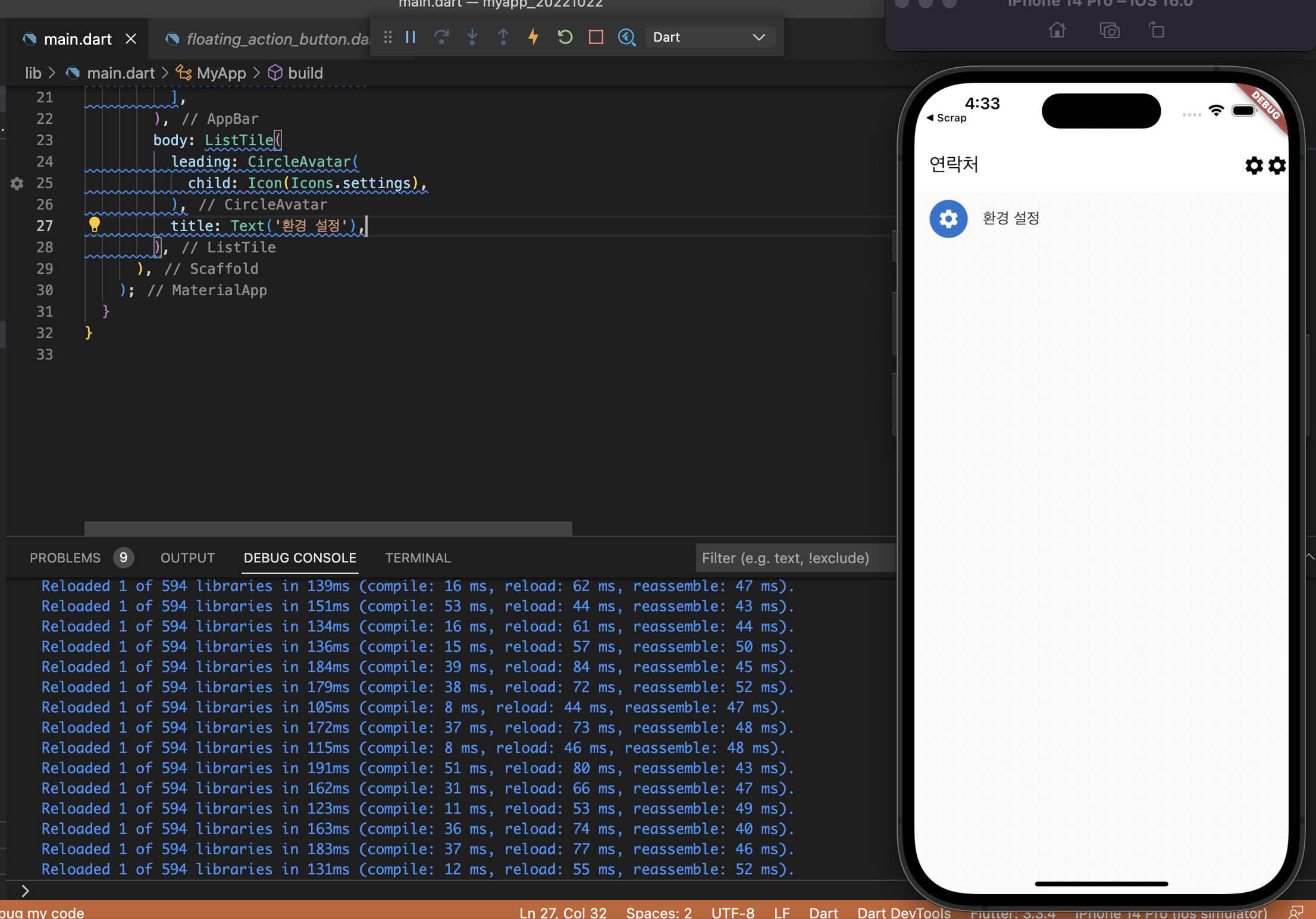
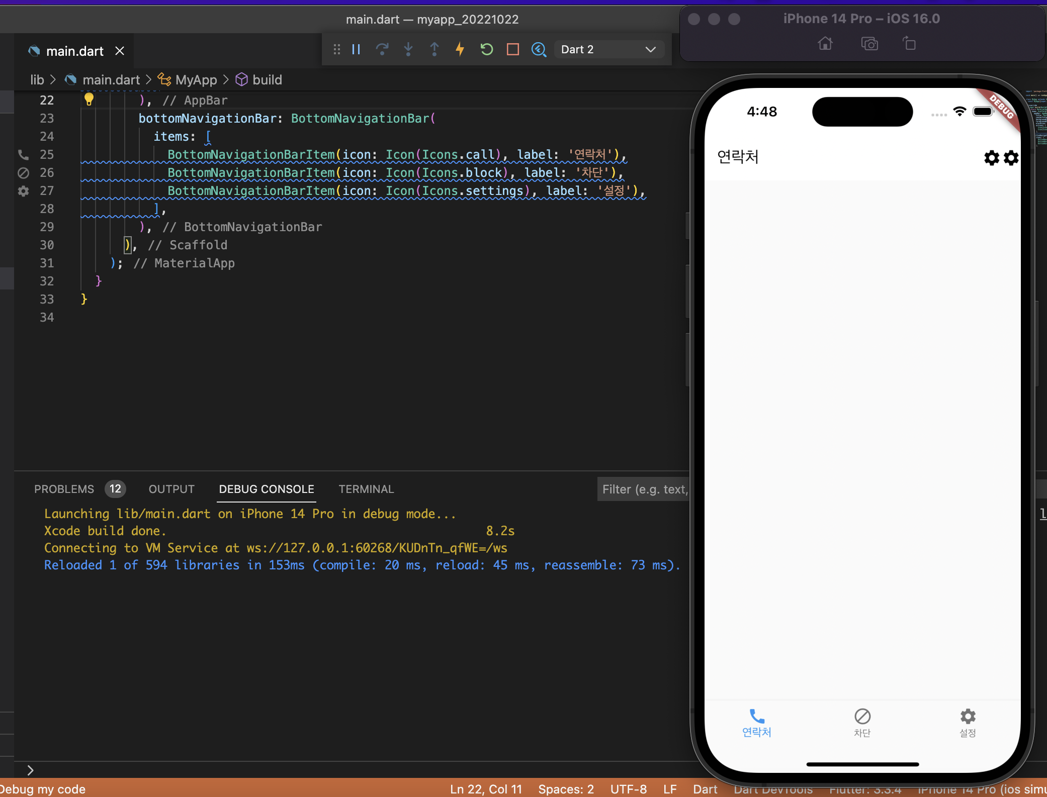
AppBar
지금까지 사용했던 속성은 leading, title, centerTitle, backgroundColor이고, 오늘 추가로 배워볼 속성은 foregroundColor, titleTextStyle, actions이다.
- leading: 앱바에 제일 앞에오는 위젯을 설정할 수 있음
- title : 앱의 타이틀(주로 텍스트 혹은 이미지)을 설정할 수 있음
- centerTitle : 타이틀을 가운데로 설정할 것인지
- backgroundColor : 앱바의 배경색을 결정
- foregroundColor : 앱바의 기본 표현 색을 결정
- titleTextStyle : title이 Text위젯을 썼다면, 적용할 텍스트 스타일 (foregroundColor 보다 힘 쌤 )
- actions : 앱 바 제일 뒤에 오는 위젯을 설정할 수 있음. 주의사항 AppBar는 trailing이 아니라 actions로 배열이 들어간다.

@override
  Widget build(BuildContext context) {
    return MaterialApp(
      home: Scaffold(
        appBar: AppBar(
          title: Text('연락처'),
          centerTitle: false,
          backgroundColor: Colors.white,
          foregroundColor: Colors.black,
          elevation: 0,
          actions: [
            Icon(Icons.settings),
            Icon(Icons.settings),
          ],
        ),
      ),
    );
  }
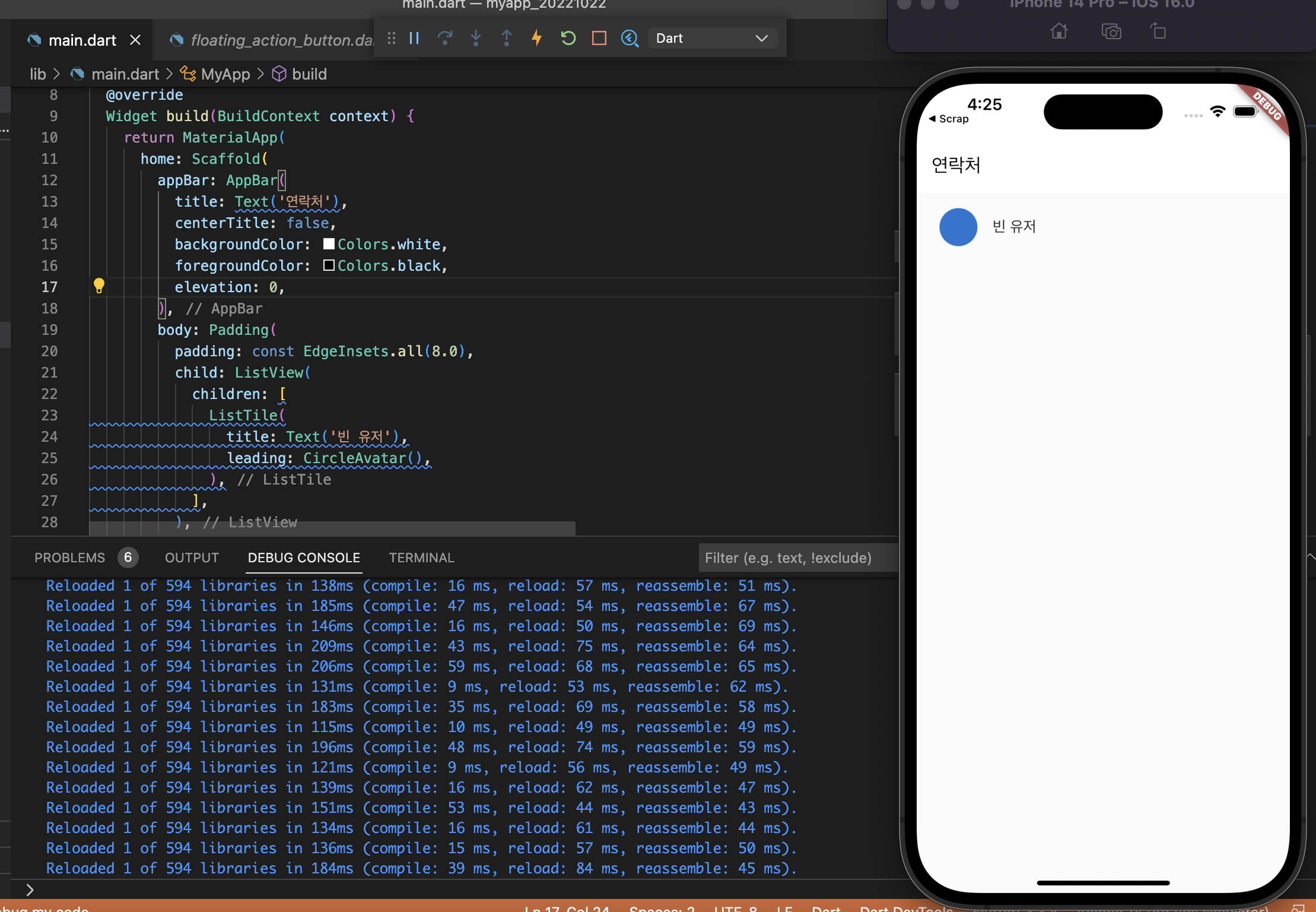
CircleAvatar 위젯
보통 아바타를 그릴 때 사용. 이미지와 함께 사용하여 동그란 이미지를 제공한다. 프로필 사진 혹은 채팅방 명, 로고 등의 이미지를 보여주기에 좋다.
@override
  Widget build(BuildContext context) {
    return MaterialApp(
      home: Scaffold(
        appBar: AppBar(
          title: Text('연락처'),
          centerTitle: false,
          backgroundColor: Colors.white,
          foregroundColor: Colors.black,
          elevation: 0,
        ),
        body: Padding(
          padding: const EdgeInsets.all(8.0),
          child: ListView(
            children: [
              ListTile(
                title: Text('빈 유저'),
                leading: CircleAvatar(),
              ),
            ],
          ),
        ),
      ),
    );
  }
child안에 들어갈 위젯을 제공한다, 텍스트 위젯을 이용해서 이미지가 없을 경우 연락처의 경우 한 글자만 넣는 경우가 있다.

@override
  Widget build(BuildContext context) {
    return MaterialApp(
      home: Scaffold(
        appBar: AppBar(
          title: Text('연락처'),
          centerTitle: false,
          backgroundColor: Colors.white,
          foregroundColor: Colors.black,
          elevation: 0,
          actions: [
            Icon(Icons.settings),
            Icon(Icons.settings),
          ],
        ),
        body: ListTile(
          leading: CircleAvatar(
            child: Text('빈'),
          ),
          title: Text('빈 유저'),
        ),
      ),
    );
  }
child 에 아이콘 위젯을 넣을 경우
프로필 사진 등을 구현하려 할 때, child를 넣어 이미지 위젯을 부르는 것보다는 backgroundImage를 사용하는 것이 추천된다.
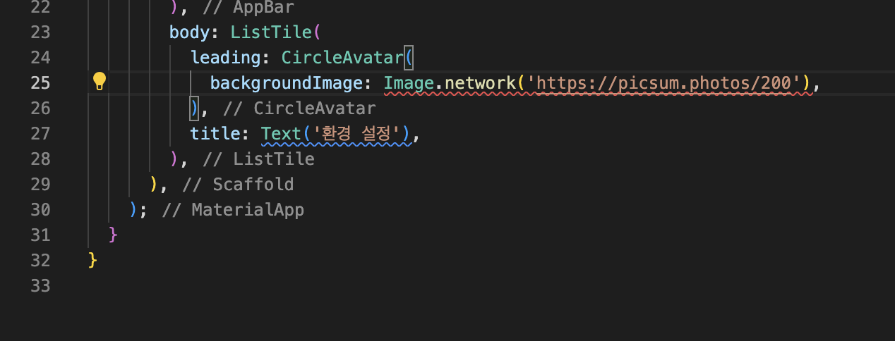
backgroundImage: Image.network(’<https://picsum.photos/200’>),
Image.network()로 구현하면 오류가 나는 것을 확인할 수 있다.
그 이유는 backgroundImage 속성은 위젯을 전달받지 않는다. ImageProvider의 데이터형태만 전달받는다.
ImageProvider인 데이터 형태의 종류는 크게 4가지이다.
- NetworkImage
- AssetImage
- FileImage
- MemoryImage

@override
  Widget build(BuildContext context) {
    return MaterialApp(
      home: Scaffold(
        appBar: AppBar(
          title: Text('연락처'),
          centerTitle: false,
          backgroundColor: Colors.white,
          foregroundColor: Colors.black,
          elevation: 0,
          actions: [
            Icon(Icons.settings),
            Icon(Icons.settings),
          ],
        ),
        body: ListTile(
          leading: CircleAvatar(
            backgroundImage: NetworkImage('<https://picsum.photos/200>'),
          ),
          title: Text('환경 설정'),
        ),
      ),
    );
  }
CircleAvatar 위젯
adius(반지름)의 크기를 키워 아바타의 사이즈를 정해줄 수 있다.
radius라는 속성에 입력된 int(정수)의 수를 조정하여 크기 조절할 수 있다.
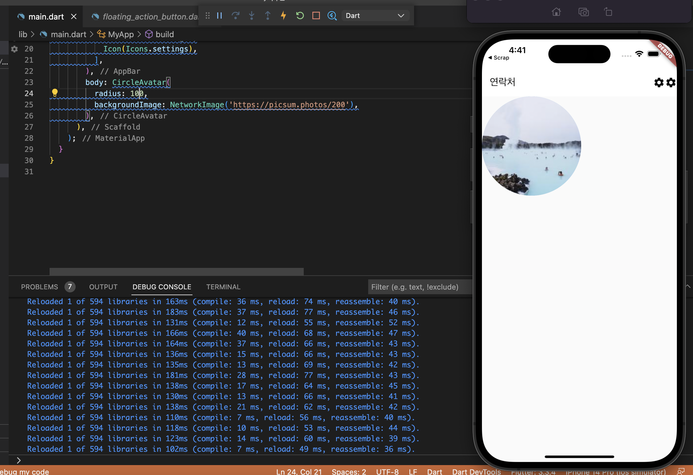
body: CircleAvatar(
          radius: 100,
          backgroundImage: NetworkImage('<https://picsum.photos/200>'),
        ),
Scaffold의 능력
Scaffold의 속성 중, appBar와 body에 위젯을 각각 넣었었다.
바로 흔히 말하는 [바텀네비게이션바, BottomNavigationBar] 그리고 [FAB, FloatfingActionBar]
BottomNavigationBar 위젯
어플은 화면을 나누어 특정한 목적을 달성하기 시키기 위한 스크린들이 존재한다.
카카오톡 → 친구창 / 채팅방 리스트 / 쇼핑 / 내 설정 인스타그램 → 피드 / 검색 / 릴스 / 쇼핑 / 내 피드
Scaffold가 이러한 기능을 사용할 수 있도록 속성을 제공한다.

BottomNavigationBar 위젯은 BottomNavigationBarItem이 하나만 있으면 오류가 발생한다.
bottomNavigationBar: BottomNavigationBar(
          items: [
            BottomNavigationBarItem(icon: Icon(Icons.call), label: '연락처'),
            BottomNavigationBarItem(icon: Icon(Icons.block), label: '차단'),
            BottomNavigationBarItem(icon: Icon(Icons.settings), label: '설정'),
          ],
        ),
BottomNavigationBar는 items라는 속성을 필수(required)로 받습니다. 그 안은 무조건 BottomNavigationBarItem만 올 수 있다.
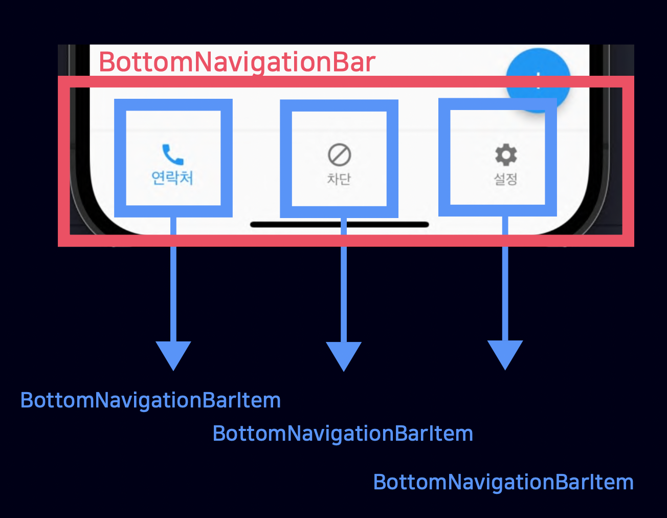
BottomNavigationBar는 조건이 있습니다.
- 여러 페이지를 위해 제공되는 거라서 버튼(BottomNavigationBarItem)이 두 개 이상이어야 함
- 각 BottomNavigationBarItem에 label속성을 넣어줍니다.
FloatingActionButton 위젯

floatingActionButton: FloatingActionButton(
          onPressed: () {},
        ),
        bottomNavigationBar: BottomNavigationBar(
          items: [
            BottomNavigationBarItem(icon: Icon(Icons.call), label: '연락처'),
            BottomNavigationBarItem(icon: Icon(Icons.block), label: '차단'),
            BottomNavigationBarItem(icon: Icon(Icons.settings), label: '설정'),
          ],
        ),
'개발 > Flutter' 카테고리의 다른 글
| Flutter 여섯 번째 강의 내용 (0) | 2022.11.01 |
|---|---|
| Flutter 다섯 번째 강의 내용 (0) | 2022.10.27 |
| Flutter 세 번째 강의 내용 (0) | 2022.10.21 |
| Flutter 두 번째 강의 내용 (0) | 2022.10.20 |
| Flutter 첫 번째 강의 내용 (0) | 2022.10.18 |